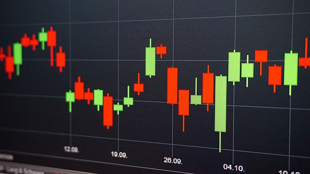
Among the many types of technical analyses available to forex traders, the single most useful and popular ones are probably candlestick charts. These were originally developed in Japan during the 18th century by a prominent commodity trader who used them to chart the fluctuations in the price of rice. For this reason, they are often known as Japanese candlestick charts, and many of the patterns that they form have Japanese names.
Simple line graphs plotting the price of a commodity at regular intervals in time had been used for centuries, but traders were in need of something that could plot more variables on a two-dimensional graph. The bar chart showing the opening, high, low and closing prices of a commodity was useful and helped traders to predict future price movements in a more reliable way than line charts, but candlestick charts were even better.
They were introduced to the American stock market and from there to the worldwide financial markets by Charles Dow at the beginning of the 20th century. Dow was the founder of the Wall Street Journal and co-founder of the Dow Jones company.
Candlestick Formations
The chart is made up of a series of “candlesticks” which typically have a chunky body with vertical lines stretching up from the top (the upper shadow or wick) and bottom (the lower shadow or wick). The different points measure the differences in prices over a certain period of time, which might be 5 minutes, 15 minutes or longer.
The top of the wick is the highest point reached during the time period and the lowest point of the lower wick is low. The top and bottom of the body are the opening and closing prices. If the price rose during the particular period, the body will be white (or green or blue if colored), indicating that the bottom of the body is the opening price and its top is the closing price. If the price fell during the period, the body will be black (or red if colored), indicating that the prices are the other way around (the bottom being the closing price and the top being the opening price).
How To Use Candlestick Charts In Forex Trading
A chart showing 5 or 15-minute candles over a period of several hours can provide the forex trader with many patterns on which he can base a system for determining when a trend is developing. For example, when the candle body is white or green and higher than the preceding candles, it indicates that buyers are very bullish. When it is black or red and lower than the preceding candles, it indicates that buyers are very bearish.
Being able to see these implications at a glance is vital in the fast-moving forex markets where trading decisions often need to be made in a split second. So candlestick charts are one of the most useful visual aids for any forex trader.